Author: katerickson Page 1 of 2
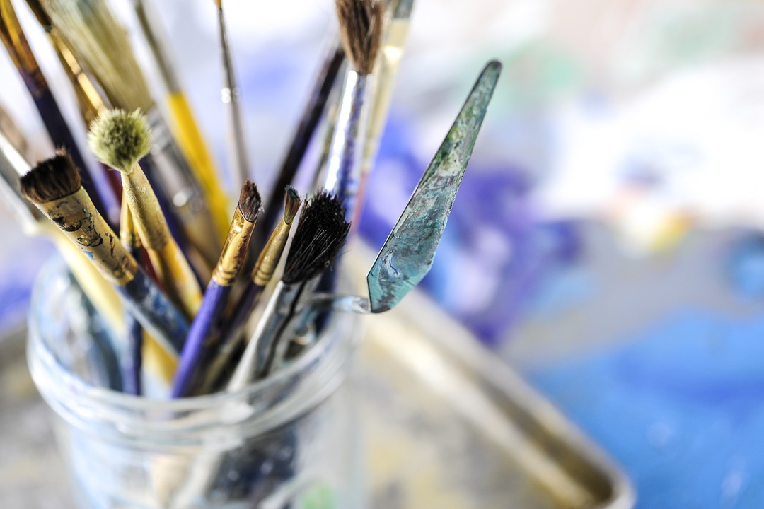
Medium: Oil on Canvas: 99% Palette Knife
Date Completed : 2/3/2019
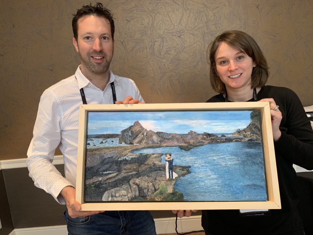
Title: A Rocky Start (It’s Funny! They’re a wonderful couple/family)
Critical Acclaim – When I gave this painting to James we were on a break during a meeting. We didn’t have much time and when I went to put the top back on the box… he put his hand down so the box couldn’t close. He was, very politely, buying an extra minute to just look at the painting. It was an awesome moment.
I wanted to get back to landscapes. For a long time I wanted to get married on overlook 2 at Great Falls Park in Virginia. And then I saw this picture that James ands friends captured with a drone at his own wedding. I wonder what he was thinking when I first asked if he minded if I painted it.
Lets get to what I learned on this one. The composition is wrong. The happy couple should be towards the bottom left of the canvas. The rocks on the left aren’t interesting. They were more interesting in the original photograph but because I didn’t find them fun to paint that didn’t come through on the canvas. I painted the water more than once and in quite a few varying shades but didn’t think to add the white reflection of the clouds until my teacher suggested it. Rocks are grey and brown and black and rarely is it easy to tell which when looking at a photo.
I loved painting this. I don’t remember having a phase where I just didn’t like it, however, while painting the rocks on the left I did find it difficult just to get started and keep going.
More to Come on this one! Gallery available now
Title: Lookout – What What Baby Butt
Canvas: 11“x 17”
Media: Oil on Canvas
Price: NFS
Date Completed: 6/15/18
Critical Acclaim: “No. Stop.”, Friend Matt
For years I sent my friend and his wife pictures of my kid’s butt’s. This is the kind of things that is funny once or twice and less funny each of the 50 subsequent times until the kids are older and your friends tell you it’s no longer appropriate to text them baby butt pictures and so you paint it because that makes it “art”!
My daughter’s skin doesn’t photograph well but the painting is solid. Her skin is pretty complex in comparison to her brother. His skin is smooth with an olive tone. Her skin ranges from ivory to a reddish tan and when hot becomes much more red. It took an hour to paint him and weeks to paint her. She’s worth it.

Title: Bethany Beach in the Afternoon
Canvas: 11“x 17”
Media: Oil on Canvas
Price: NFS
Date Completed: 12/24/2017
Critical Acclaim: “Aunt Kat, I LOVE IT!”, Madeline: Age 7
Bethany for Madeline
I’ve fallen in and out of love with this painting quite a few times. The sand is too dark.. the water on the left is too weird. But none of that matters because MADELINE loves it.
I don’t know how many times i have to learn the lesson that preparation is the most important step. I should have taken some artistic liberty on the sand and never looked back.
ui
Title: Lookout – Self Portrait at 35
Canvas: 11“x 17”
Media: Oil on Canvas
Price: NFS
Date Completed: 4/30/2017
Critical Acclaim: “Down voting selfie” – imgur.com user carlosspicyweener
The process: http://imgur.com/a/Y46YS
This painting was exactly as hard as one would expect. I’ve learned that I need to learn how to draw. There’s only so much shading that you can do to fix major issues.
After completing this painting I read the portraits chapter in “Traditional Oil Painting” by Virgil Elliott. Even with all of Gail’s help I really wish I’d read that chapter before taking this on. A couple of his pointers that I remember weeks after reading it are that hair should never have a hard line to the background and that the likeness is so much more important than the detail. He likened this to how a friend can recognize you from a distance. They don’t need to see the details of your face to know it’s you. That’s what you have to be able to capture in a painting. I… did … not… accomplish that.
I know this painting is average at best, but I really like it. I feel like you can see the direction of the light. I feel like the shape of the hair is pretty good, and the fact that the eyes turned out looking realistic at all is a miracle.
Things I learned. Do not paint in a window with direct sunlight. You can see the results of this in the attached album. Gail helped me mix three skin tone colors to start and I painted this with lights, darks, and mediums and then blended those before adding the pinks and highlights. That made this go much more quickly. I also learned that portraits and skin should have very blended transitions. Any time the colors were separated by hard lines the painting looked fake.
Thanks to my mom, Jackie Watkins, for suggesting the album below where everyone can see the process.
Title: Big Sister Dancing
Canvas: 20“x 20”
Media: Oil on Canvas, Palette Knife/Brush
Price: NFS
Date Completed: 1/22/2017
Critical Acclaim: “Oh, It’s Big Sister!” -Karoline Erickson (2)
After finishing The Family Tree (see previous post) I needed to paint without rules or grids or sketches. My mom gave me a color wheel for Christmas that provides the most basic rules of color theory for oil painting. When I started The Family Tree, Gail (I’m just going to refer to my teacher as Gail from here on out. No need to introduce the great Gail Pean in every blog. We know Gail by now) suggested that I use it as a color theory exercise. She suggested that if I used the color wheel to guide me instead of strict adherence to my picture that the result would be beautiful. We’ll never know if she was right (she was probably right).
So in an effort to paint without rules I took my color wheel and read the rules of color theory and decided to paint a picture with a tetrad which is using a combination of four colors on the wheel that are two sets of compliments.
There was also a picture of Karoline I couldn’t get out of my head. She was switching back and forth between princess dresses and I snapped this picture. Thus, I showed up at paint class with a 20×20 canvas, an inspiration, and 4 colors that I wanted to use. I did not expect this to go anywhere. It was supposed to be a fun day of freedom. But in painting as in life, I just fall in love so easily. Gail and I started to see something really nice taking shape and we took this journey together, constantly stepping back to look and decide which direction to go next.
I spent about 5 hours on this painting. I learned about tints, tones, and shades. I learned that I gained a certain level of comfort with my palette knives and can now use them with a bit more confidence. The color wheel doesn’t lie and Karoline is my muse.
I brought the painting home and left it to dry on my easel in the garage. I took Karoline out and said “Do you know who this is?” She took one look and said, “Oh! It’s Big Sister!” Success.
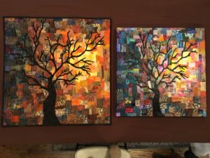
Title: The Family Tree
Canvas: 20“x 20”
Media: Oil on Canvas, Palette Knife/Brush
Price: NFS
Date Completed: 12/19/2016
Process: http://imgur.com/a/wQd8r?
A labor of love? A labor for love? This painting was a lot of work! My mother (Jackie Watkins) is an art quilter and I had been thinking about doing a painting of one of her quilts. She is known for her creativity in quilts featuring trees so it made sense to paint my favorite of those. I had no experience with palette knife except for one 3 hour class and whatever I soaked in from watching Bob Ross.
The quilt took my mom three days and took me approximately four months. I believe most of my time was spent mixing paint. My teacher, Gail Pean, constantly encouraged me to stray from strict adherence to the original quilt. I was working off of a picture of the quilt and I felt like each week the colors looked slightly different (Gail also encouraged me to print the darn thing out. I didn’t). When my mom brought the original quilt to Virginia over Christmas I felt like I was looking at a pattern I knew by heart in a color scheme I had never seen before.
Maintaining the proportions was the other struggle. I used an open source image manipulation program (GIMP) to display the picture with a grid of about 1″ squares. I then blocked off the same grid on the canvas. I’d spend hours during the week sketching the quilt blocks and then painted them at class on the weekends and then also at night as my Christmas deadline approached.
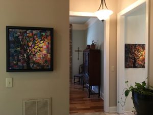
I was in love with this painting when I first sketched the tree on the canvas. I fell out of love with it when I felt that the difficulty greatly exceeded my skills and experience. I fell back in love with it anytime I thought about finally being able to give it to my mom and I love the end result. I also love how my mom has them displayed in her home.
I learned so much with this painting. Indian Red and Pinkish Reds are my least favorite colors to mix. Blues and teals are harder to mix but more fun (all the shades are cool instead of just the end result). There is much more variation in yellows than I previously realized. Buy palette knifes that are a little bendy. Don’t try to make small squares with a palette knife for four months. Quilts have many repeating fabrics. I should have painted each fabric at once instead of square by connecting square.
The side by side picture has awesome detail if you want to zoom and see amateur palette knife painting at it’s finest 😉
.
Student Art Show at Unitarian Universalist Church in Reston Virginia. Only the best pieces get the spot next to the fire alarm. They do that to make sure these masterpieces are the most protected in case of emergency.
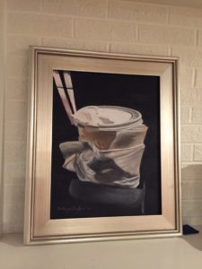
Title: Copy Kat
Canvas: 16“x 20”
Media: Oil
Price: NFS
Date Completed: 6/12/2016
Process: http://imgur.com/a/RPdNN
I loved doing this painting. I really felt like I could continue painting it every week for the next year or so. My teacher had just completed the same painting. It took her about 3 hours to do the whole painting. She cut me off at ~21 hours (3 hours each Sunday for 7 Sundays). It was supposed to be a quick lesson in painting color values.
People have been painting tea/coffee cups for hundreds of years! Gail snapped this picture on her cell phone of a coffee cup while on a bus in New York City.
Things I learned. You have to paint texture to make sure things look real. In the beginning I thought I could fudge the different brown values (not make them exact) and end up okay. This lead to lots of layers until I finally concentrated and got the colors right. You absolutely have to step back a few feet from your painting every hour or so to see if you getting off track.